Field Note
Menswear Editorial Recce. Italian Restaurant
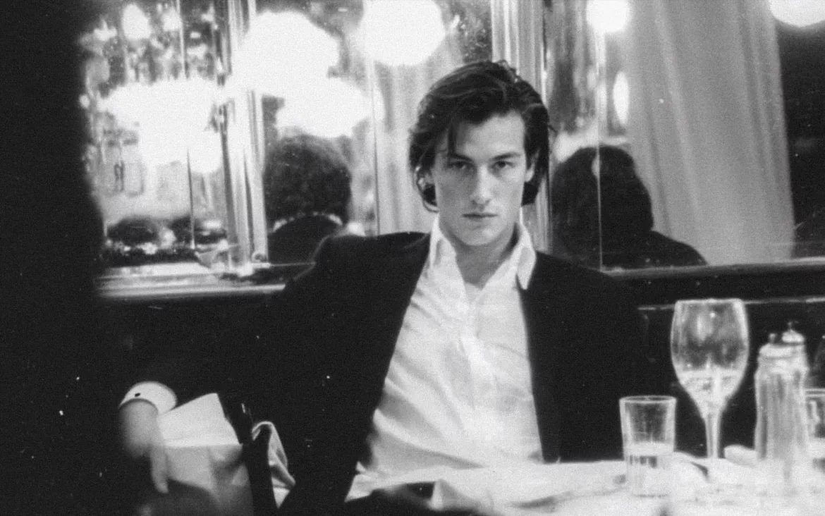
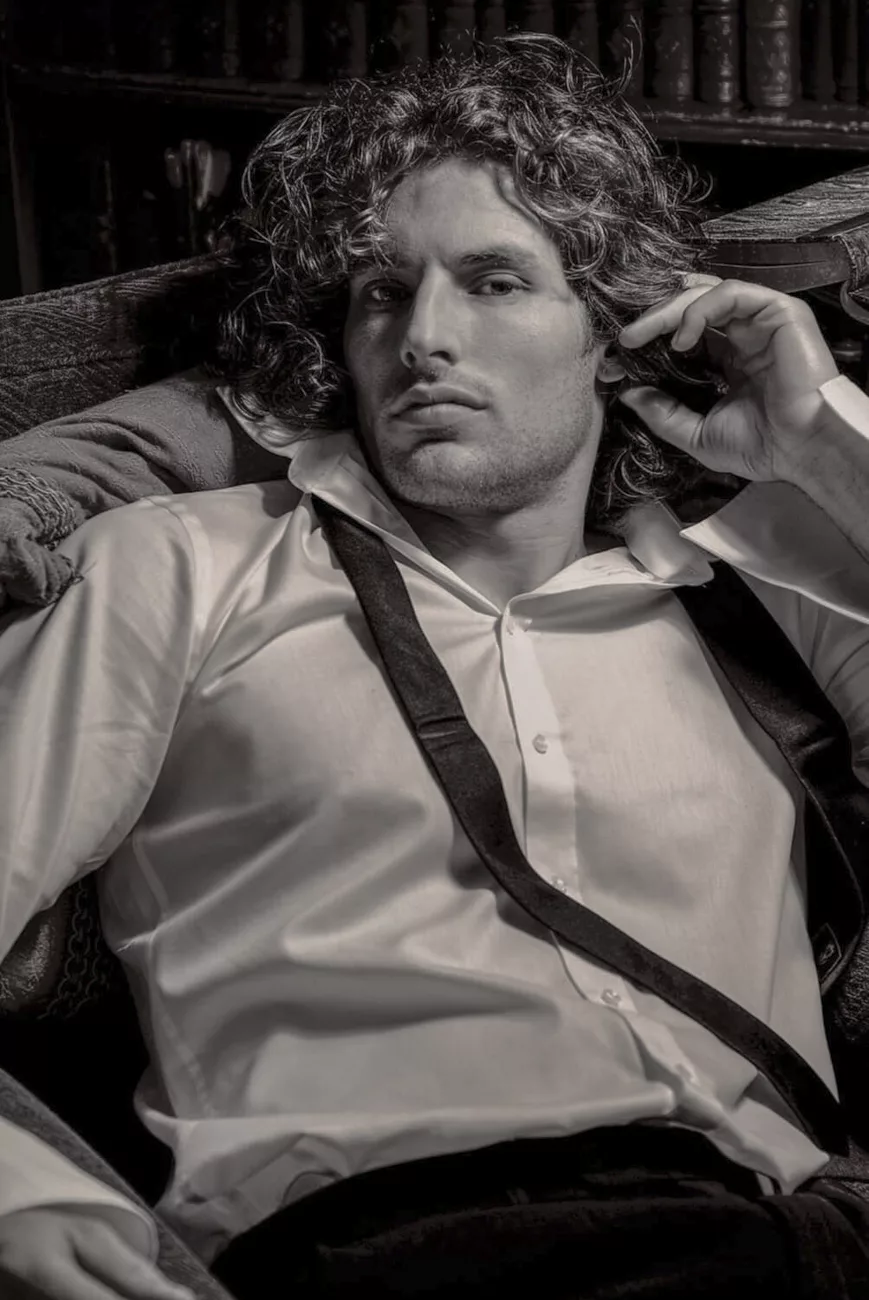
This came in as a menswear editorial commission. Straightforward on the surface. Magazine pages to fill, looks to make work, and a location that had to justify itself quickly. When a job arrives like that, there is very little room for indulgence. You walk in already weighing whether the space can carry the work or whether it will need rescuing.
The Space and Its Limits
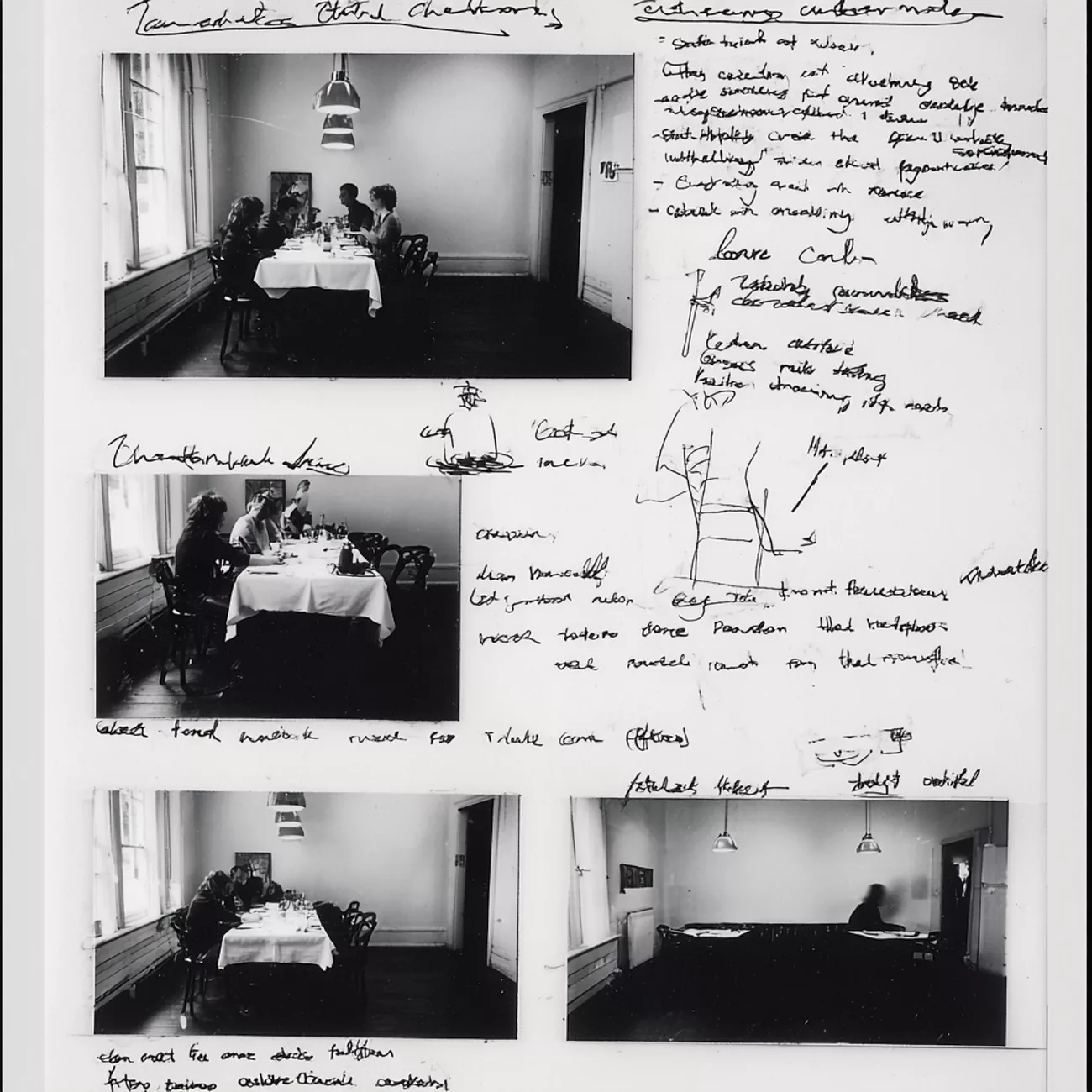
The restaurant was tight. That was clear immediately. Low ceiling, tables pulled close together, walls that did not give you much distance. Mixed light everywhere. Ambient spilling in from outside, practicals doing their own thing, corners falling away quicker than you would like.
It is the kind of space that often gets dismissed early because it does not look flexible or controllable.
But it had weight.
Proper Italian. Traditional without trying to perform tradition. No garish décor. No visual noise. It was not styled to be photographed, which is usually a good sign. In black and white, that matters. Colour can disguise a lot. Monochrome exposes structure. Once stripped back, the room held together. It simplified itself if you let it.
Atmosphere Over Reference
There was an immediate familiarity to it. Something that sat quietly between Little Italy in New York and the way restaurants exist in older films. Not as reference points, more as atmosphere.
Tables that felt permanent. Corners that suggested repetition. A sense that the room had already hosted its own scenes long before we arrived.
That familiarity was useful, but it needed restraint. Push it too far and it turns into costume. I was not interested in nostalgia or imitation.
The idea stayed loose. Cinematic, but relaxed. A Goodfellas undertone without the aggression or the performance. Casual rather than declarative. Almost French in attitude. The feeling of a scene rather than a setup.
The location supported that balance. It anchored the work without dictating it.
Light. Agreement, Not Control
Lighting had to respect the space. There was no room, physically or conceptually, for complexity.
I used a single large blonde 2K as the main source. Proper film light. Broad, forgiving, and honest. Skin responds well. Fabric responds well. It describes form without forcing it.
The ambient light coming in from outside was unavoidable. Instead of fighting it, I balanced it. I allowed it to sit just strong enough to act as a soft fill. The blonde remained the main voice.
Too much control and the scene starts to feel arranged. Too little and you lose structure. I wanted the light to feel agreed upon rather than imposed.
Shadow and Fall-Off
I did not correct the shadows. I let them fall.
Light landed on the subject and then dropped away naturally. That fall-off did most of the work. Darkness is not absence. It is structure. Especially in menswear. Too much information flattens the image and kills the mood.
Angle, Distance, and Position
I thought through angles before committing. The ceiling ruled out anything too low. High angles flattened the space and made it feel apologetic. Eye level felt right. Slightly off-axis. As though you were not meant to be standing exactly where you were.
Doorways helped. The edges of tables. Corners that introduced layers without closing the space down. I wanted the sense of arriving mid-moment rather than constructing one.
Clothing as Presence
What mattered with the clothing was not detail. It was how it sat.
Weight. Line. Silhouette.
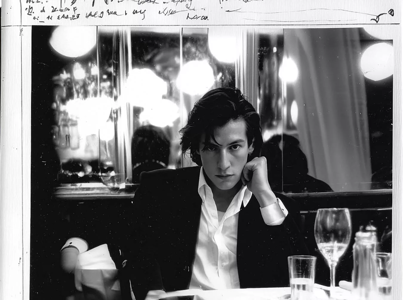
The menswear needed to belong to the room, not be placed into it. I wanted it to feel like a still lifted from a film. Contemporary clothes, but not contemporary lighting. Softer. Less insistent. Something you notice after the fact.
Direction and Behaviour
Direction stayed minimal.
I was not interested in posing. The moment it starts to feel arranged, the whole thing collapses. The model needed time to settle. To sit properly. To stand without thinking about how it read.
Behaviour mattered more than posture. I watched for the moment when awareness of the camera dropped away. That is usually when the frame appears.
Constraint as Clarity
The constraints shaped everything.
The size of the room dictated lens choices. The ambient light dictated exposure decisions. The layout was not negotiable.
You work with what is there or you do not work at all. I have always found that limitations simplify things if you stop resisting them. They remove the illusion of choice and force clarity.
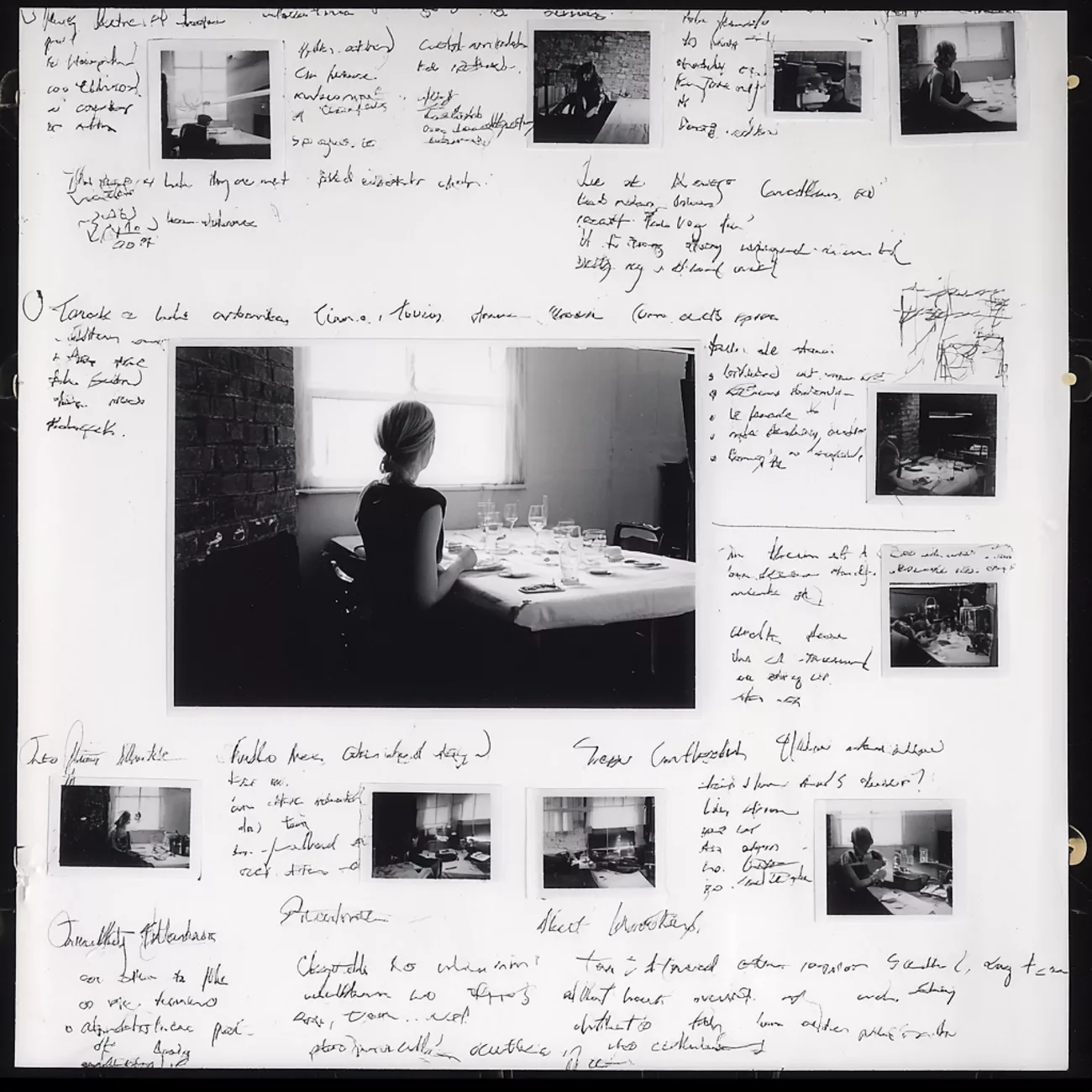
The Recce and the Book
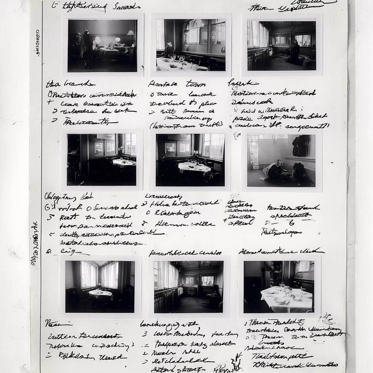
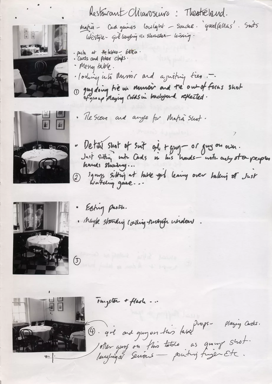
Because this was a recce, I documented it properly. I always do.
Polaroids. Quick images. Printed references. Cut-outs. All of it went into a physical book. Part field notes, part mood reference. It allows intention to be understood without explanation.
That way of working goes back years. Assisting in Athens with Uli Weber. Classifying locations. Photographing spaces before models arrived. Assigning looks later.
 Back then it was film. Rolls numbered. Frames logged. Shoot three, film eleven, frames A, B, C. F-stops noted so decisions could be made in the lab. There was not much latitude. You had to be precise.
Technically, that discipline is no longer required. Dynamic range has changed everything. I still work the same way. It keeps me honest. I like being able to look back and understand why something worked, not just that it did.
I lost many of those books over the years. Starting again felt necessary.
Stepping Away
By the time I stepped away from it, the room felt different. Not transformed. Just settled.
The light had found its balance without being corrected. The shadows were doing their job quietly. The space no longer felt tight. It felt contained.
That shift matters more to me than whether a frame is perfect.
I have learned to recognise that moment over time. When you stop arranging and start noticing. When the scene stops asking for ideas and starts offering them back.
It is subtle. Easy to miss if you are still chasing outcomes.
I wrote the final notes then. Not because everything was clear, but because nothing needed forcing.
Some work wants refining.
Some work wants silence.
This belonged to the second kind.
Note to Me
When the location carries its own character, direction should slow down, not step in. Give the subject time to occupy the space before intervening. Watch for the moment when behaviour replaces awareness of the camera. That is usually when the frame stops feeling constructed and starts to hold on its own.


